KDP Cover Design for Puzzle Books (Thumbnail Test)
KDP cover design for puzzle books starts at thumbnail size: readable type, clear puzzle label, and wrap math that matches your page count.
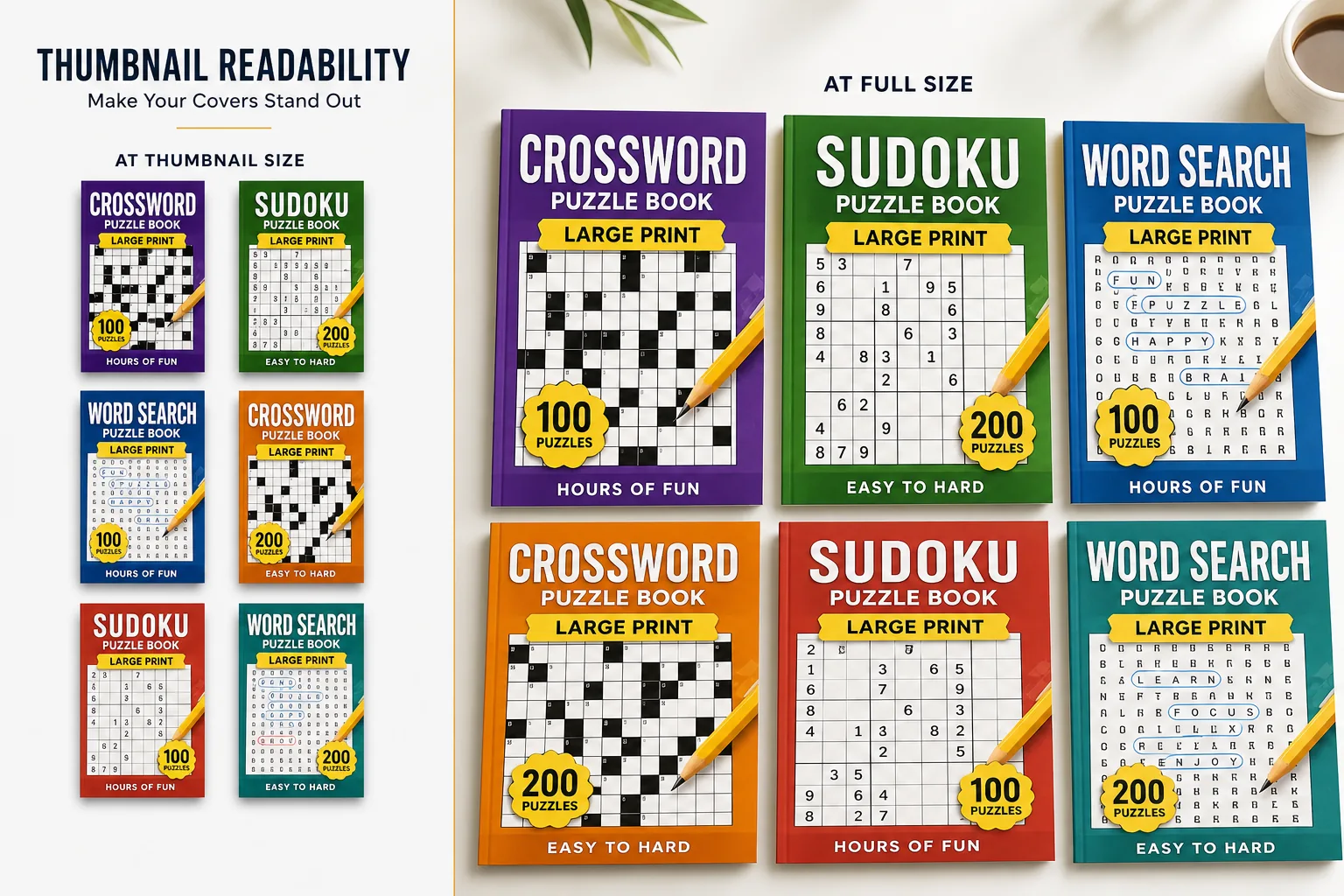
KDP cover design for puzzle books is a thumbnail test first: if the puzzle type and title fail at ~90px, the wrap fails in search. Build concepts in the KDP cover designer, and lock wrap size with the KDP cover size calculator guide.
Your cover is selling at 90 pixels wide. That is the width of a book thumbnail in Amazon's search results on a standard desktop screen. On mobile, where more than half of Amazon shopping happens, it is even smaller. Everything on your cover that is not legible at that size is invisible to the buyer making their purchasing decision.
This is the central discipline of KDP puzzle book cover design: every element must justify its presence at thumbnail scale. A beautifully detailed illustration that disappears into noise at 90px is a wasted design investment. A bold title in 80% of the cover width that reads clearly at 90px converts browsers into clicks.
This guide covers: the hierarchy of cover elements by thumbnail impact, type choices that work at small sizes, common design mistakes and their fixes, cover design conventions by puzzle type, the technical specifications KDP requires, and how to brief or build a cover that performs in Amazon search.
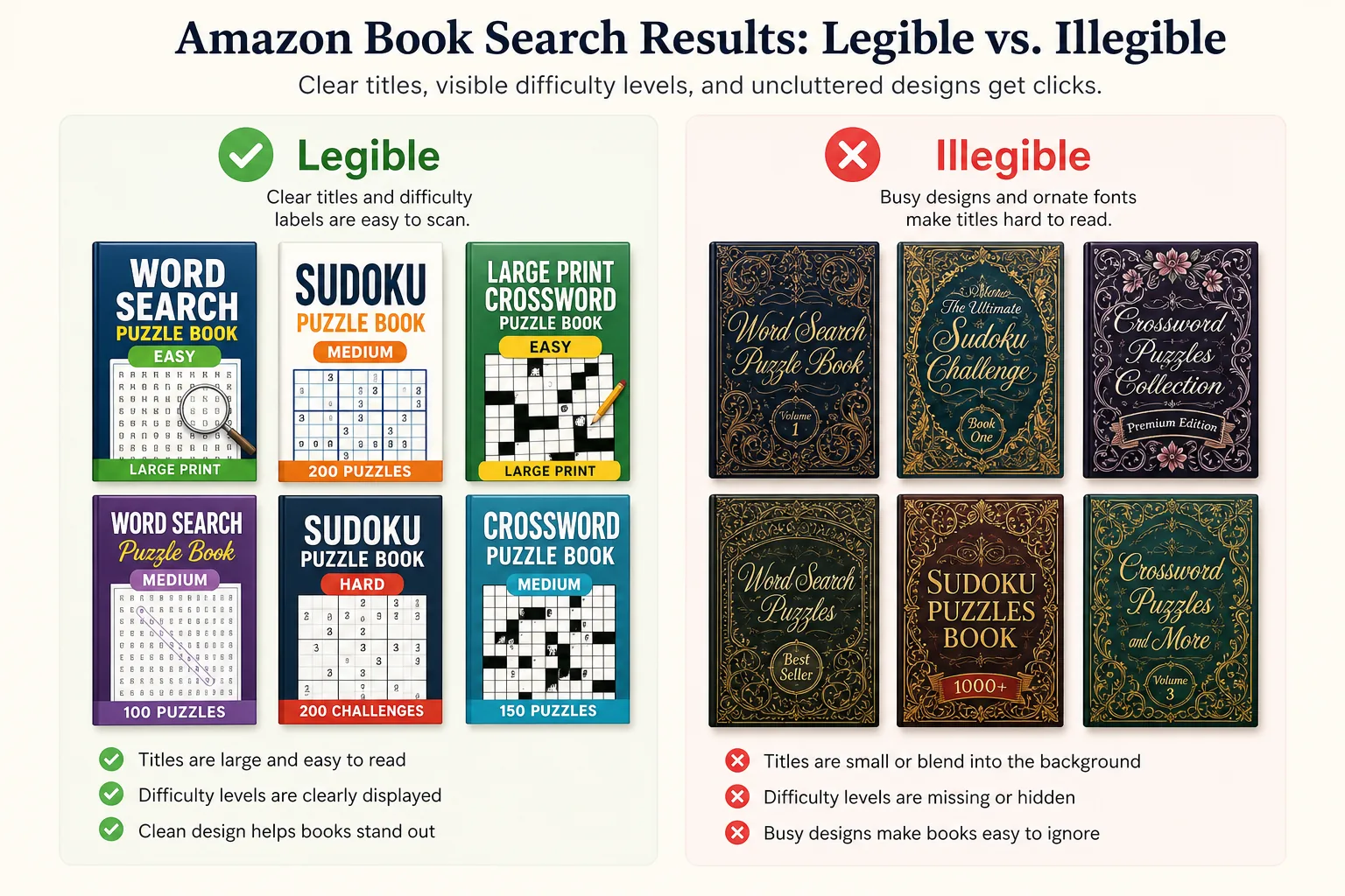
See also: spine width and full-wrap covers, A+ Content module sizes, and title lines that fit the cover.
The Thumbnail-First Design Principle
Most cover design advice talks about beautiful covers. The better goal is *functional* covers, covers that communicate their core message in the 1.5 seconds a buyer spends scanning a row of search results.
At thumbnail size, a buyer can register:
One bold text element (your title or the dominant word in it)
One color impression (is this book dark/premium, light/accessible, or bright/fun?)
One visual shape (grid pattern? illustration? abstract?)
That is your entire first impression. If your thumbnail communicates the wrong color impression (dark cover for a "Easy" book), wrong type hierarchy (decorative text that blurs), or wrong visual (stock imagery that could belong to any book), you lose the click.
The thumbnail test: Before finalizing any cover, open it in a browser, zoom it to 90px wide, and evaluate. Can you read the difficulty level? Can you read the word "crossword" or "sudoku"? Can you tell at a glance that this is a puzzle book for a specific audience? If not, the cover needs revision.
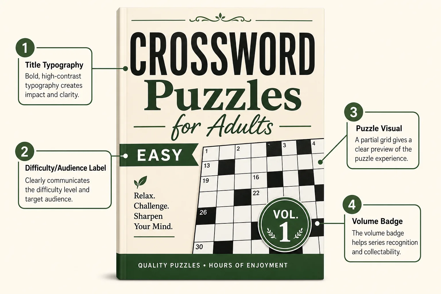
The Four Thumbnail-Critical Cover Elements
1. Title Typography: The Non-Negotiable
Your title text must be the dominant visual element on the cover, the largest, heaviest, most contrasting element. At thumbnail size, every other design element should be secondary to the title reading clearly.
Rules for thumbnail-readable title typography:
Weight: Use a black (900) or ultra-bold (800) typeface. Light or medium weight typefaces blur at small sizes
Size: Title text should occupy at least 60-70% of the cover width
Contrast: White text on dark background, or dark text on light/pale background. Never medium-grey text on any background
Font choice: Sans-serif or geometric fonts read best at thumbnail size. Decorative or script fonts degrade into unreadable shapes at 90px
Avoid all-caps thin lettering: Widely spaced thin capitals look elegant at full size and invisible at thumbnail
Single most important word rule: If your title is "Easy Crossword Puzzles for Adults Vol. 1," the word "CROSSWORD" or "EASY" must be the largest single element on the front face. Buyers scanning at speed register the biggest word first.
2. Difficulty and Audience Label: The Second Read
After the title, the next element a buyer needs to register is the difficulty level and audience target. "EASY" in a contrasting accent color, or "FOR SENIORS" in a clear secondary band, performs this job.
How to place difficulty labels effectively:
Use a contrasting accent color for the difficulty word (e.g., green for easy, orange for medium, red for hard)
Place it immediately above or below the main title where it reads as a subtitle
Size it at approximately 40-50% of the title text size
Never let it compete with the title for visual dominance, it should be clearly secondary
3. Puzzle Visual: The Category Signal
A puzzle-related visual confirms the book's category at a glance. This is not about aesthetics, it is about eliminating category ambiguity for buyers scanning quickly.
Puzzle visuals that work at thumbnail size:
Partial grid pattern: A 9x9 sudoku grid fragment, a 15x15 crossword grid, or a word search grid pattern used as background texture or foreground element. The grid communicates "puzzle book" immediately
Bold geometric shapes: Abstract interlocking shapes, maze-like line patterns, or letter grid patterns communicate the puzzle category without requiring full grid detail
Simple iconography: A bold, high-contrast pencil, crossword square, or number tile icon
Puzzle visuals that fail at thumbnail size:
Detailed landscape illustrations (become a blur of color at 90px)
Photographs of people solving puzzles (faces and expressions are invisible at thumbnail)
Intricate decorative borders or ornaments (become visual noise)
4. Volume Number: The Series Signal
For series books, the volume number must be visible at thumbnail. Buyers who finished Vol. 1 scan for Vol. 2 by recognizing the cover system and finding the volume number.
Volume number placement: Bottom-right corner is the most common position. It should be large enough to read at thumbnail but visually subordinate to the title. Use the same type treatment (font, color) across all volumes for consistency.
Cover Design by Puzzle Type
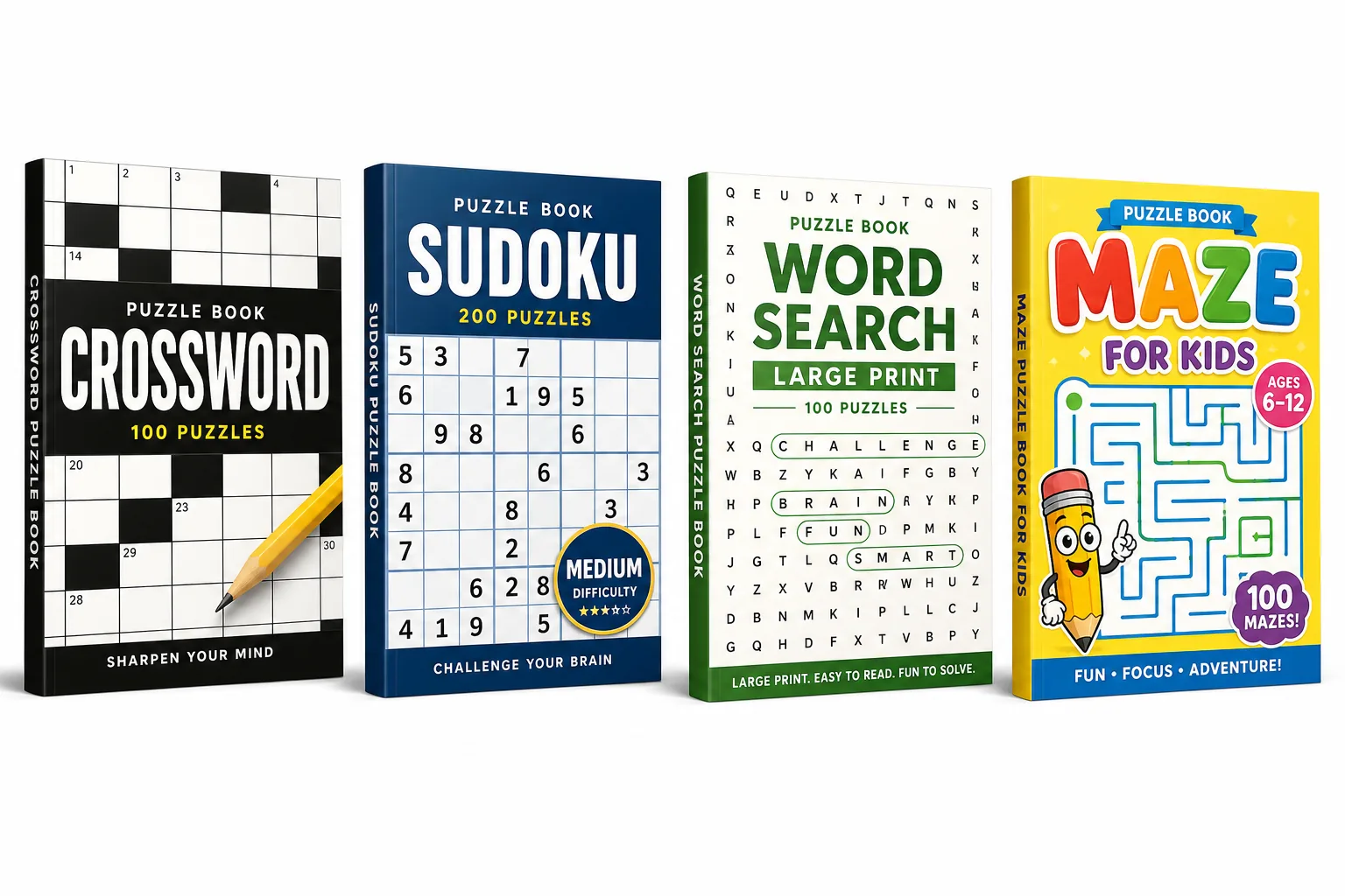
Different puzzle types have established visual conventions on Amazon. Deviating too far from these conventions can signal "not the product I expected" to buyers, even if your cover looks objectively beautiful.
Crossword Books
Dominant convention: Crossword grid pattern as background or central visual element. Bold white or black title text. Difficulty-specific color accent. Conservative, "serious" adult feel for standard editions.
Bestselling visual patterns:
White background with black grid pattern overlay and large colored title text
Dark navy/forest green/black background with white title and grid fragment
Cream background with black grid, matching the "newspaper puzzle" aesthetic
What to avoid: Overly decorative covers with flourishes and script fonts, these look like novelty gifts rather than puzzle books, confusing the buyer's expectation.
Sudoku Books
Dominant convention: Number grid fragment or abstract grid background. Color-coded difficulty (many top publishers use red for hard, blue for standard, green for easy). Clean, minimal aesthetic.
Bestselling visual patterns:
Solid color band (full-cover or partial) with large number-grid background in a lighter shade
Clean white cover with a centered sudoku grid fragment and large bold title
Dark background for "expert" editions; light/bright for "easy" editions
Word Search Books
Dominant convention: Letter grid as background or foreground element. Theme-specific imagery or color palette layered over the grid. More variety in visual approach than sudoku or crossword.
Bestselling visual patterns:
Theme-specific color palette with grid letter background at low opacity
Illustrated theme element (bird, flower, religious symbol) combined with word-grid texture
Simple flat-design approach with grid pattern and bold title
Senior/large-print editions: Soft pastel color palette, warm tones, nature imagery. Bright neon or dark backgrounds are associated with younger audiences and underperform in senior searches.
Maze Books
Dominant convention: Maze path visual as the dominant graphic element. Dark and dramatic for adult/hard editions; bright and colorful for kids editions.
Bestselling patterns:
Full-cover maze path illustration (the maze IS the cover background)
Bold contrasting title over maze visual
Kids editions: character navigating a maze, bright colors, cartoon style
KDP Cover Technical Specifications
Full-wrap cover PDF:
KDP requires a single PDF file containing the back cover, spine, and front cover as one continuous image, read left-to-right.
File specifications:
Format: PDF (flattened, no layers, fonts outlined or embedded)
Color mode: RGB (not CMYK: KDP uses RGB printing)
Resolution: 300 DPI minimum at final print size
Bleed: 0.125 in on all outer edges (top, bottom, outside edges of front and back)
Safe zone: Keep all text and critical imagery 0.25 in from all edges (including spine edges)
Spine width calculation:
White paper: page count × 0.002252 inches
Cream paper: page count × 0.0025 inches
Example: 200 pages white paper = 0.45 in spine width
Full cover width formula:
(Trim width × 2) + spine width + (bleed × 2)
For a 6×9 book with 200 pages on white paper: (6 × 2) + 0.45 + (0.125 × 2) = 12.70 in wide, 9.25 in tall
Use KDP's Cover Calculator (available in the "Paperback Cover" step in KDP setup) to get exact dimensions for your specific page count. This updates automatically as your page count changes.
Common Cover Design Mistakes
Mistake 1: Small, thin title text The most common mistake. Decorative thin fonts look sophisticated at full size and are illegible at thumbnail. Always use heavy weight typography.
Mistake 2: Too many elements competing for attention A cover with an illustration, two decorative borders, an author photo, three text sizes, and a logo strip has no visual hierarchy. Buyers cannot identify the main message in 1.5 seconds.
Mistake 3: Low-contrast color combinations Light grey text on white, dark blue on black, yellow on white, these combinations fail at print and on screen. Use high contrast: white on dark, dark on light.
Mistake 4: Spine text too small or misaligned The spine must include title and author/brand name for books over 100 pages. Spine text must fit within the spine width safe zone. Test spine legibility at actual spine width before finalizing.
Mistake 5: Cover designed only at full size Never finalize a cover without running the thumbnail test (described above). Open the finished cover, zoom to 90px wide, and evaluate all four thumbnail-critical elements.
Using RodBooks Cover Designer
RodBooks Cover Designer provides KDP-optimized templates pre-configured for puzzle book conventions, with thumbnail-tested title typography, difficulty-label placement, puzzle-visual backgrounds, and automatic spine width calculation based on your page count.
Design your puzzle book cover →
Frequently Asked Questions
Do I need a professional designer for my KDP puzzle book cover?
Not necessarily. A well-executed template with strong typography, correct sizing, and a clear hierarchy often outperforms an over-designed custom cover. If you use a tool like RodBooks Cover Designer or Canva with KDP-specific dimensions, you can produce a thumbnail-functional cover without hiring a designer. Custom illustration adds cost and time that rarely translates to proportional sales uplift for puzzle books (where clarity beats aesthetics).
What is the minimum cover resolution KDP accepts?
KDP requires 300 DPI at the final print dimensions. For a 6×9 cover at 300 DPI, the front face alone is approximately 1,800 × 2,700 pixels. Always design at or above these dimensions and export as a high-resolution PDF.
Should I put my author name on the cover?
Yes, for series coherence and professionalism. Place it at the bottom of the front cover in smaller text. If you publish under a brand name or pen name, use that consistently, this becomes your recognizable "publisher" identity in Amazon's catalog.
Can I use stock photos on my KDP cover?
Yes, if licensed appropriately. Ensure any stock image you use includes a commercial print license that covers POD (print-on-demand) books. Read the license terms carefully, some stock sites restrict POD use. iStock, Shutterstock (Extended License), and Adobe Stock Extended licenses are generally safe for KDP.
Cover Design Checklist
Title text occupies 60-70% of cover width
Title uses a weight-800 or heavier typeface
Difficulty/audience label is clearly visible as secondary text
Puzzle-type visual confirms category at thumbnail size
Volume number visible for series books
High contrast between text and background
Thumbnail test completed (viewed at 90px wide), all critical elements readable
Spine includes title and author/brand name
Technical spec: 300 DPI, full-wrap PDF with 0.125 in bleed
Spine width calculated from actual page count
Cover reviewed in KDP's Cover Previewer before publishing